Din type specimen book
Typography, editorial / 2023 Fall
Graphis New Talent 2025 Gold
Typography, editorial / 2023 Fall
Graphis New Talent 2025 Gold
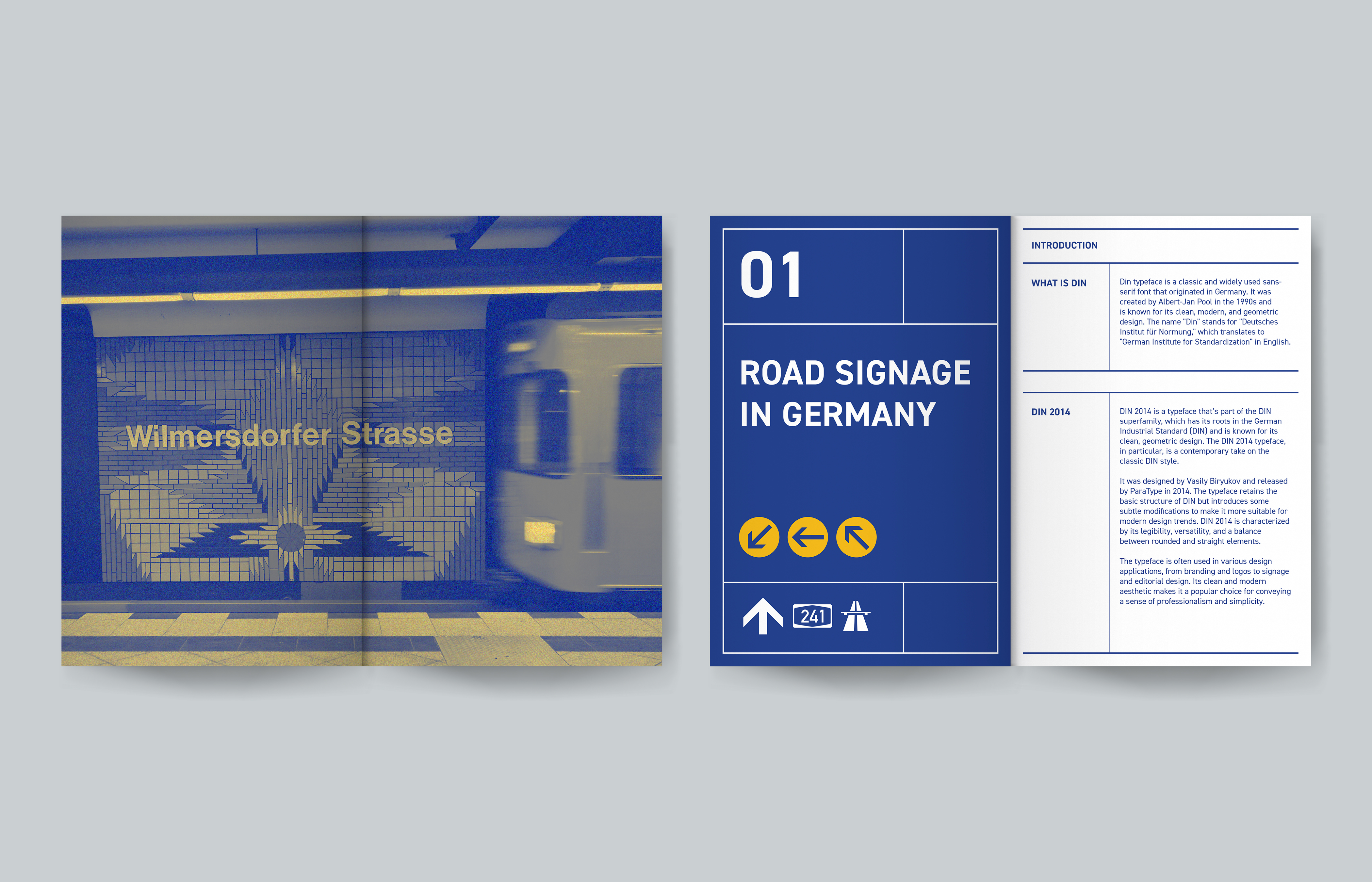
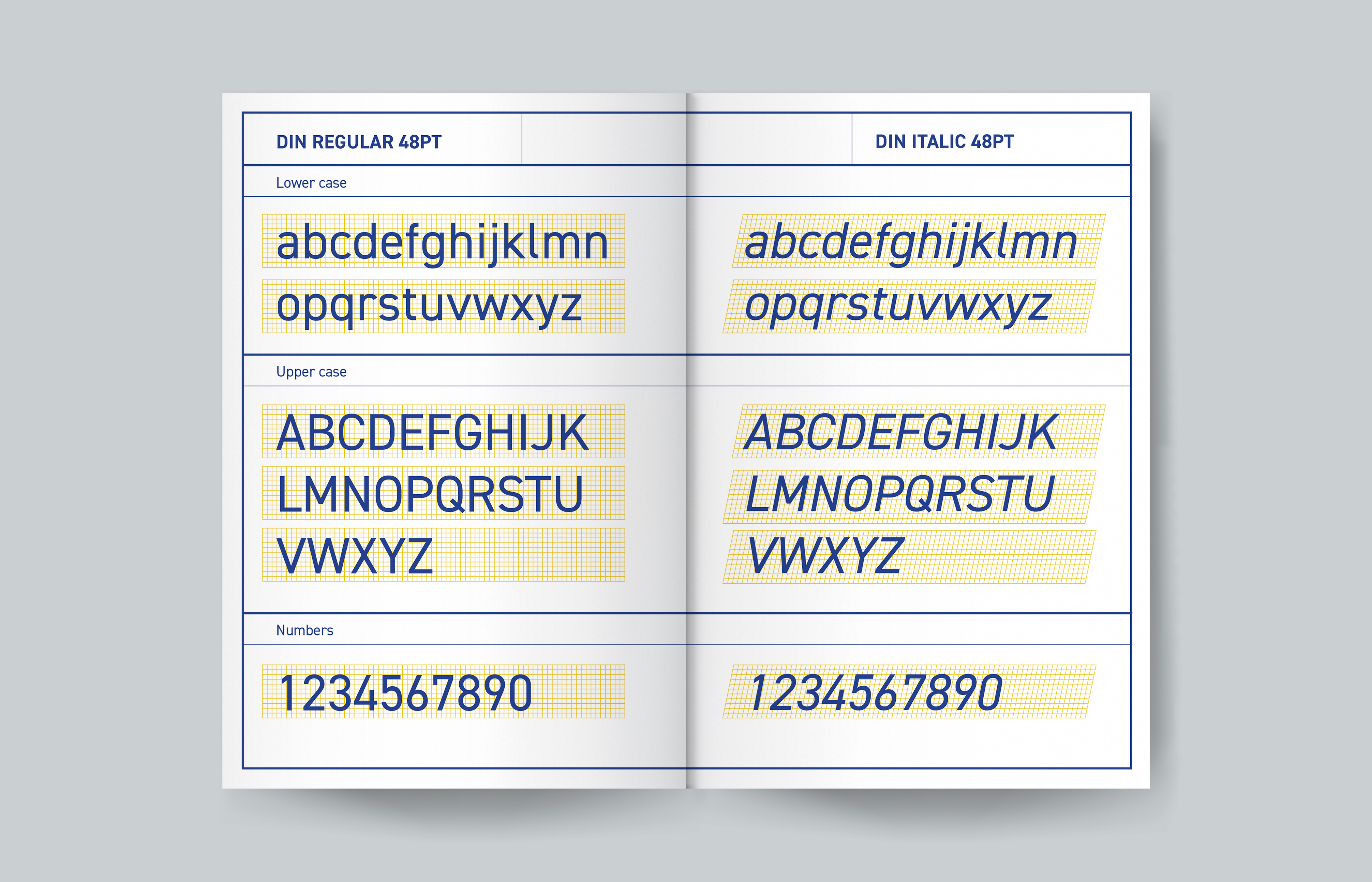
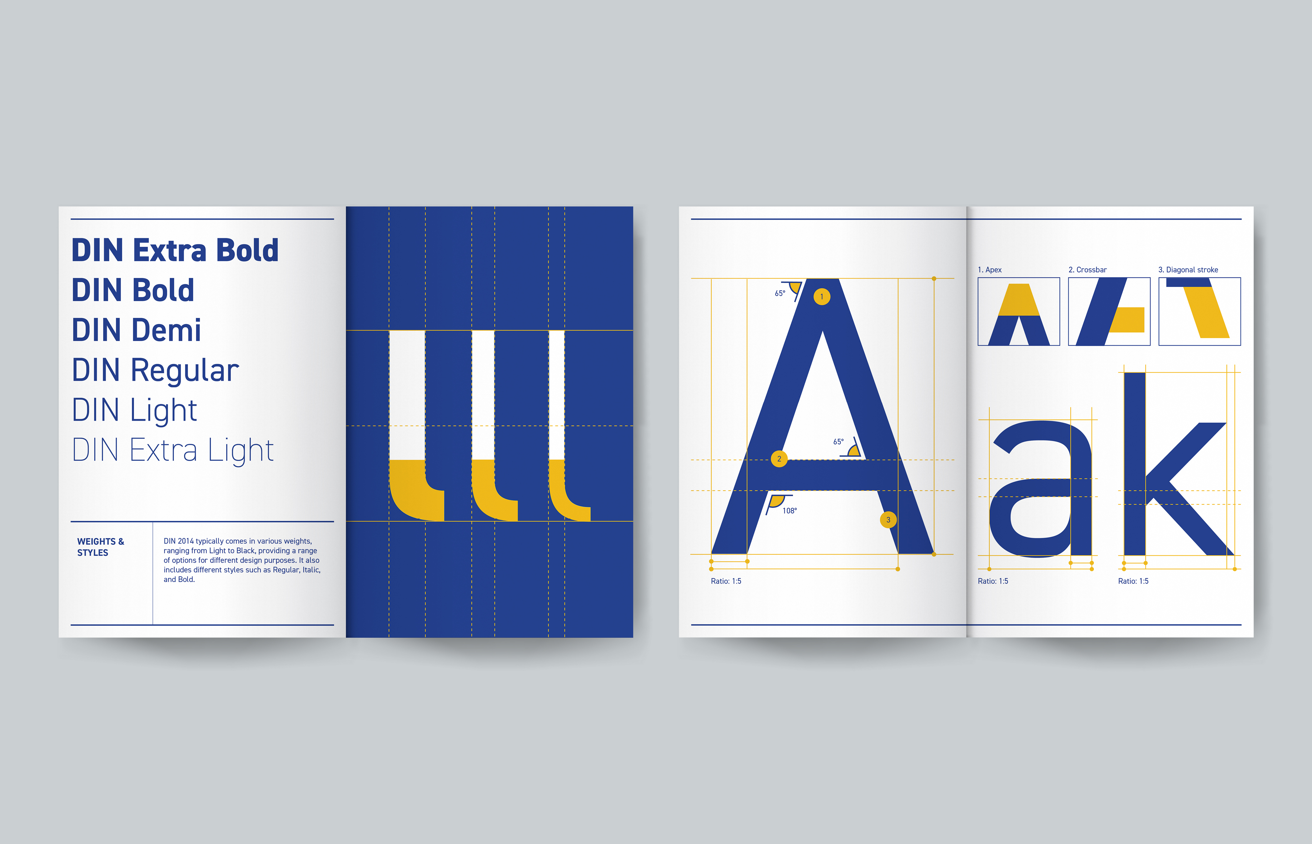
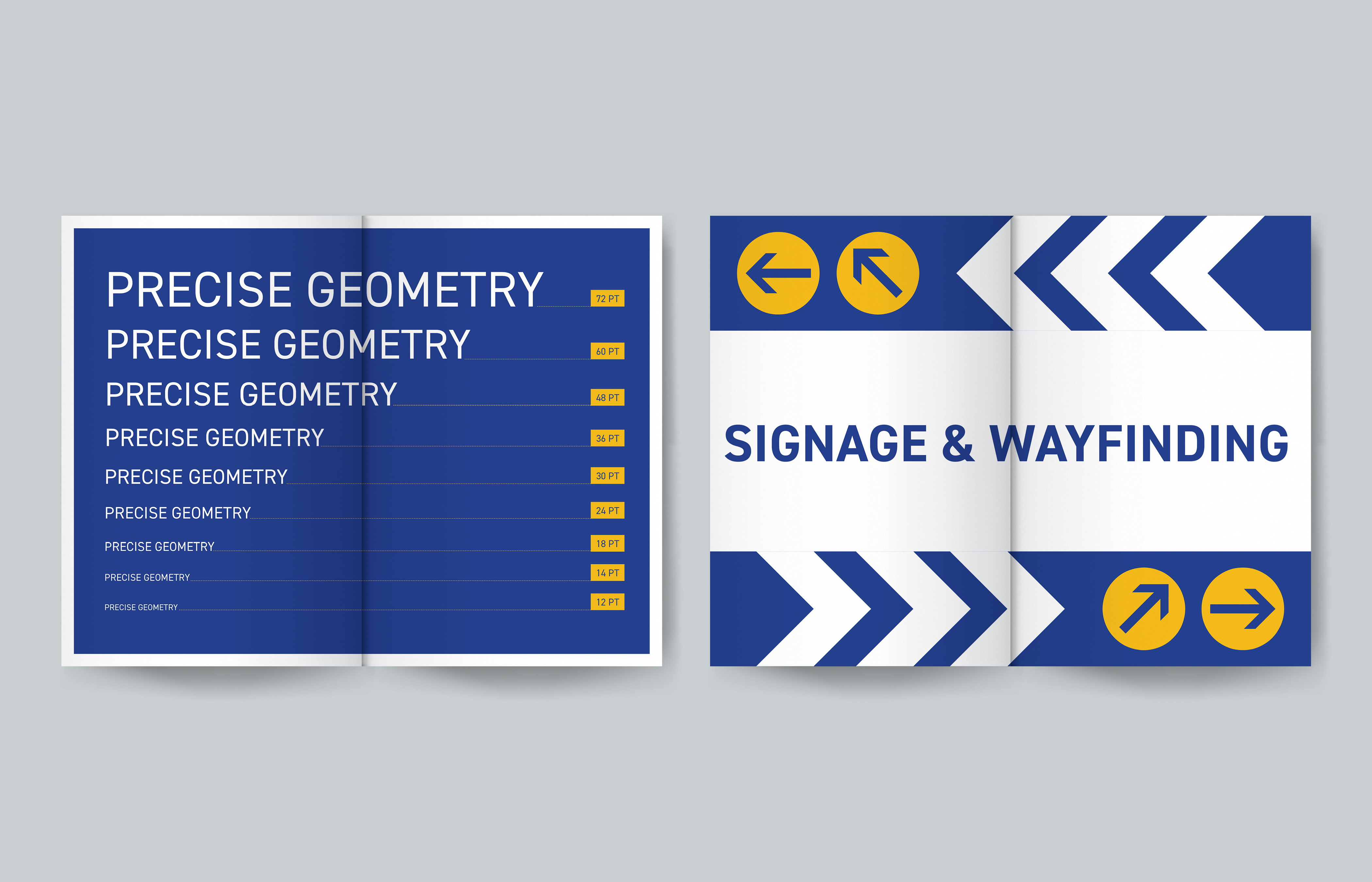
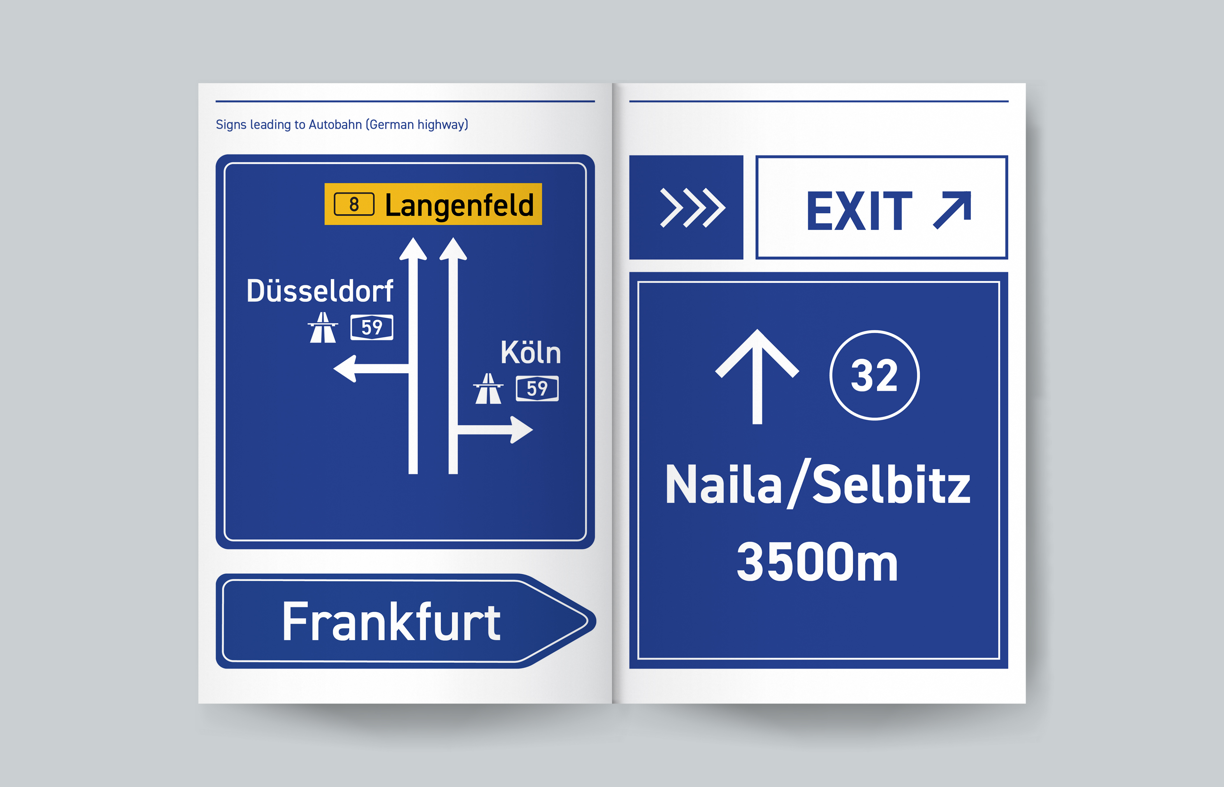
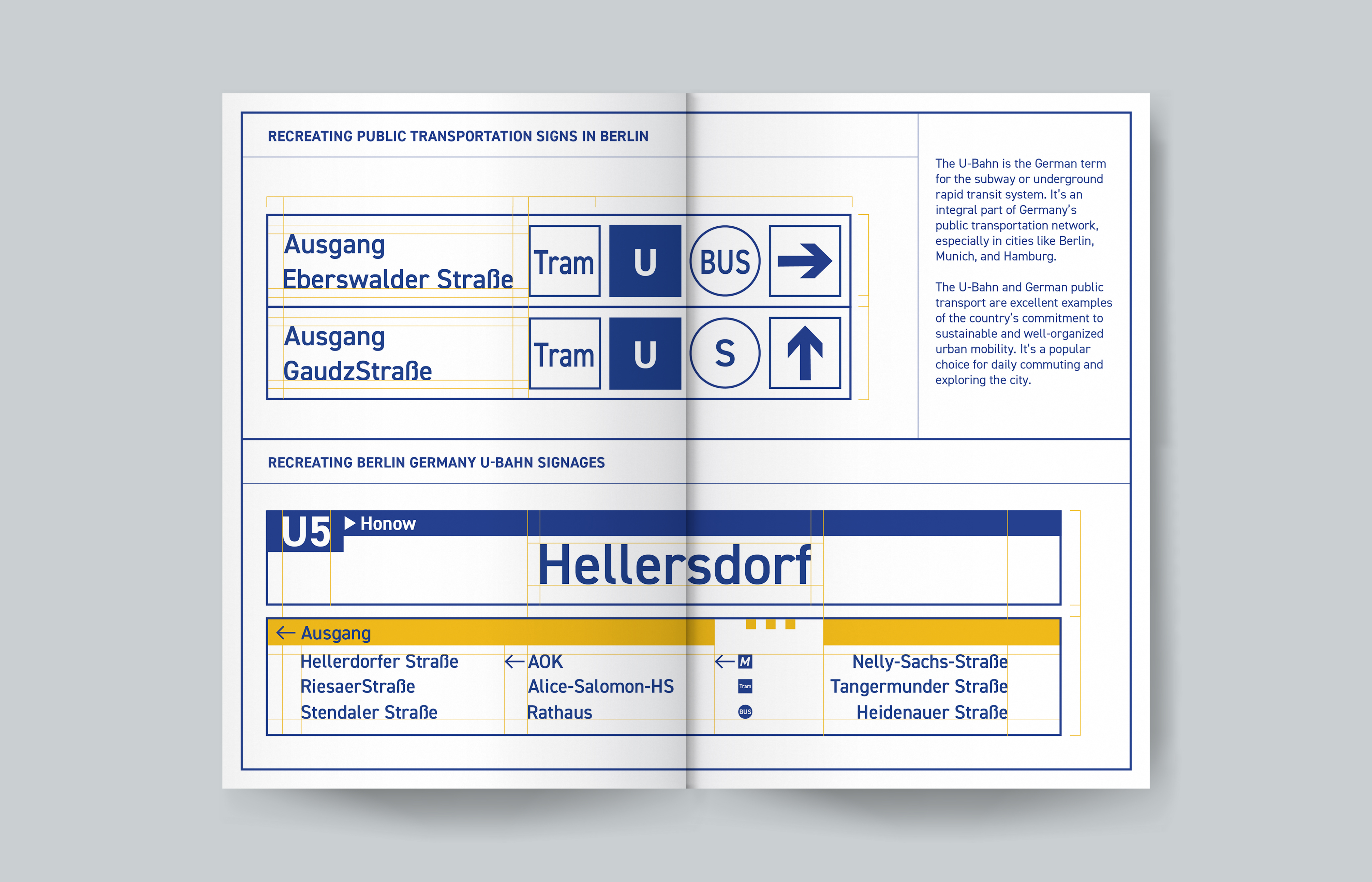
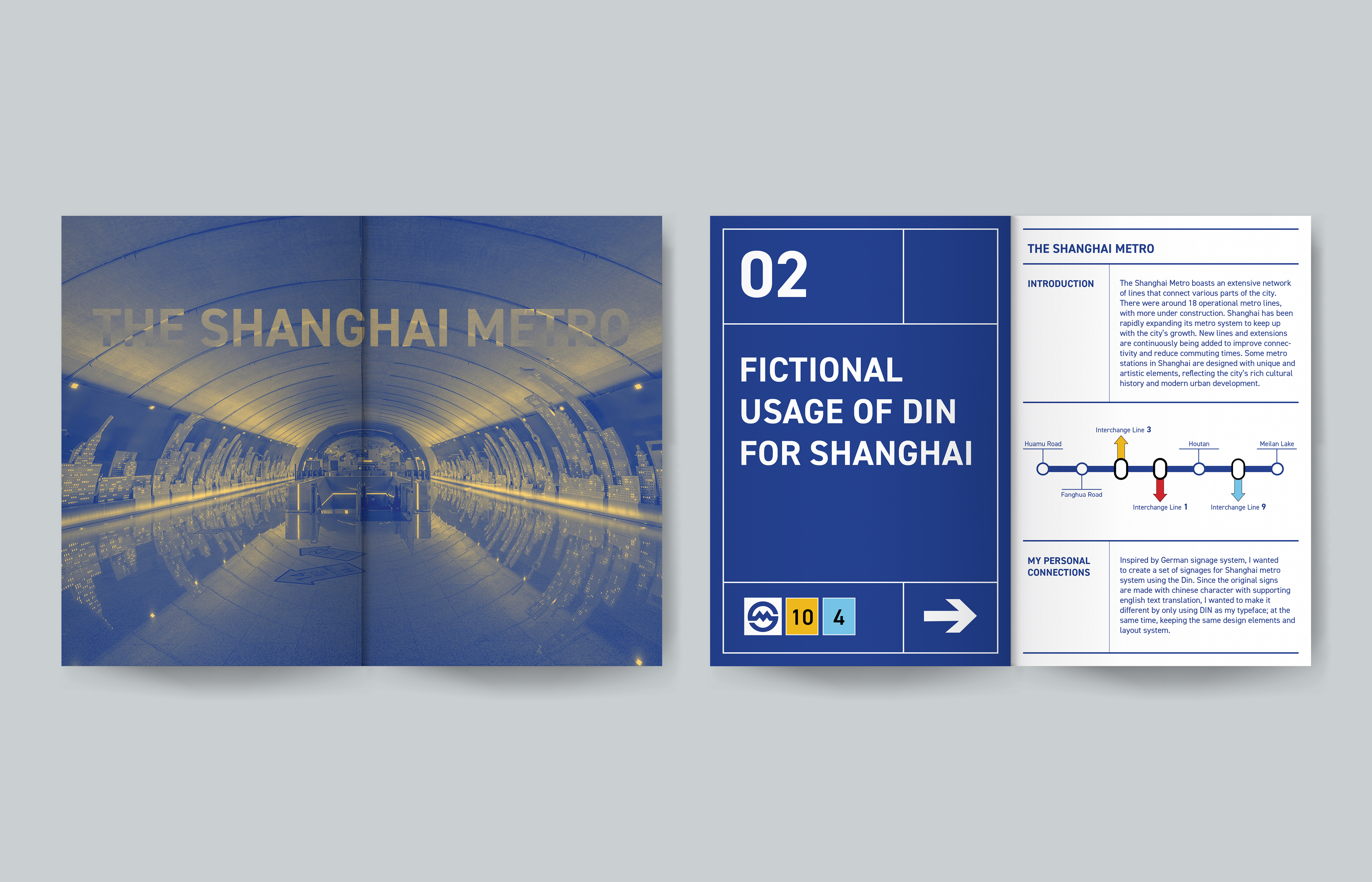
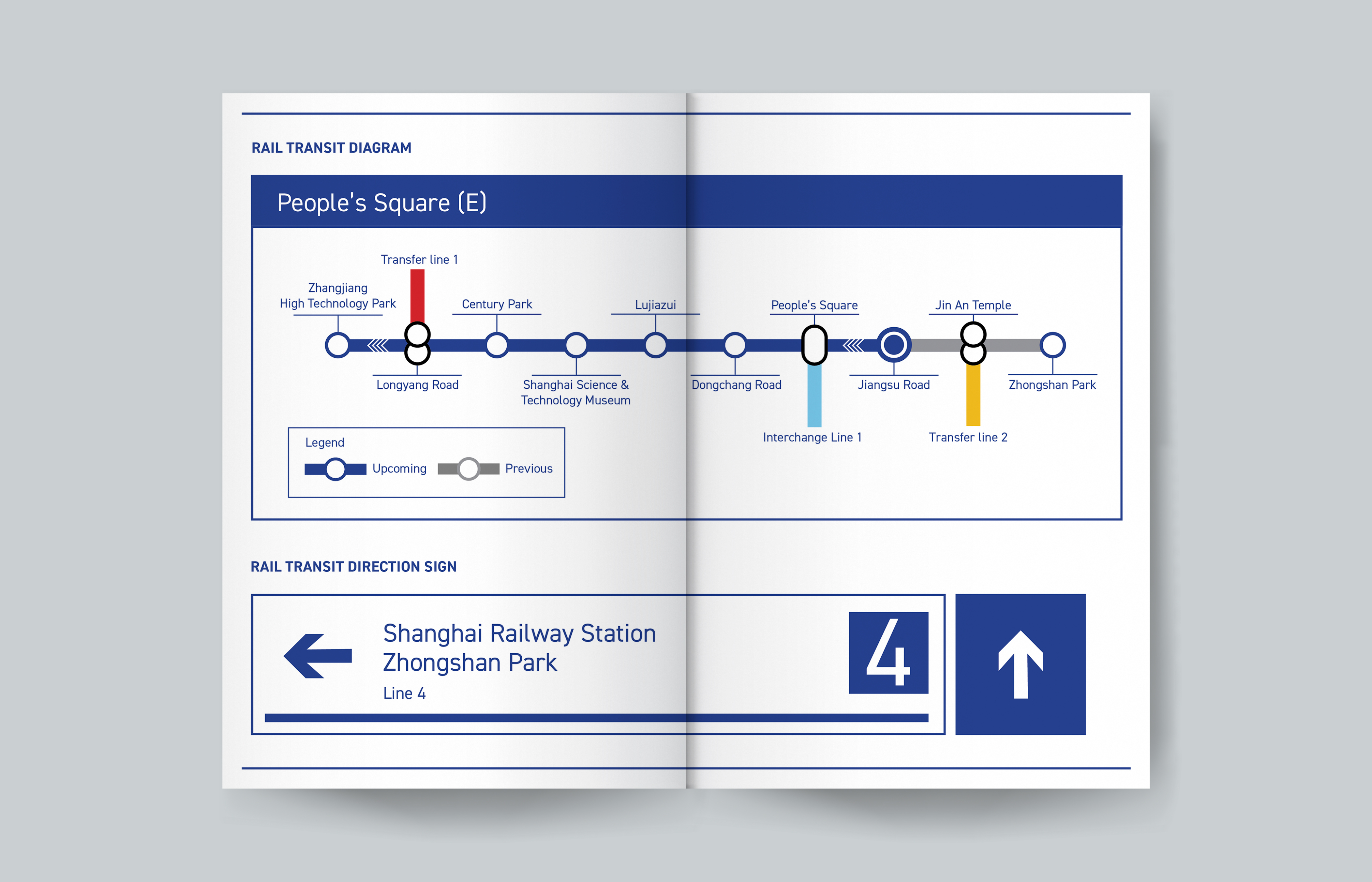
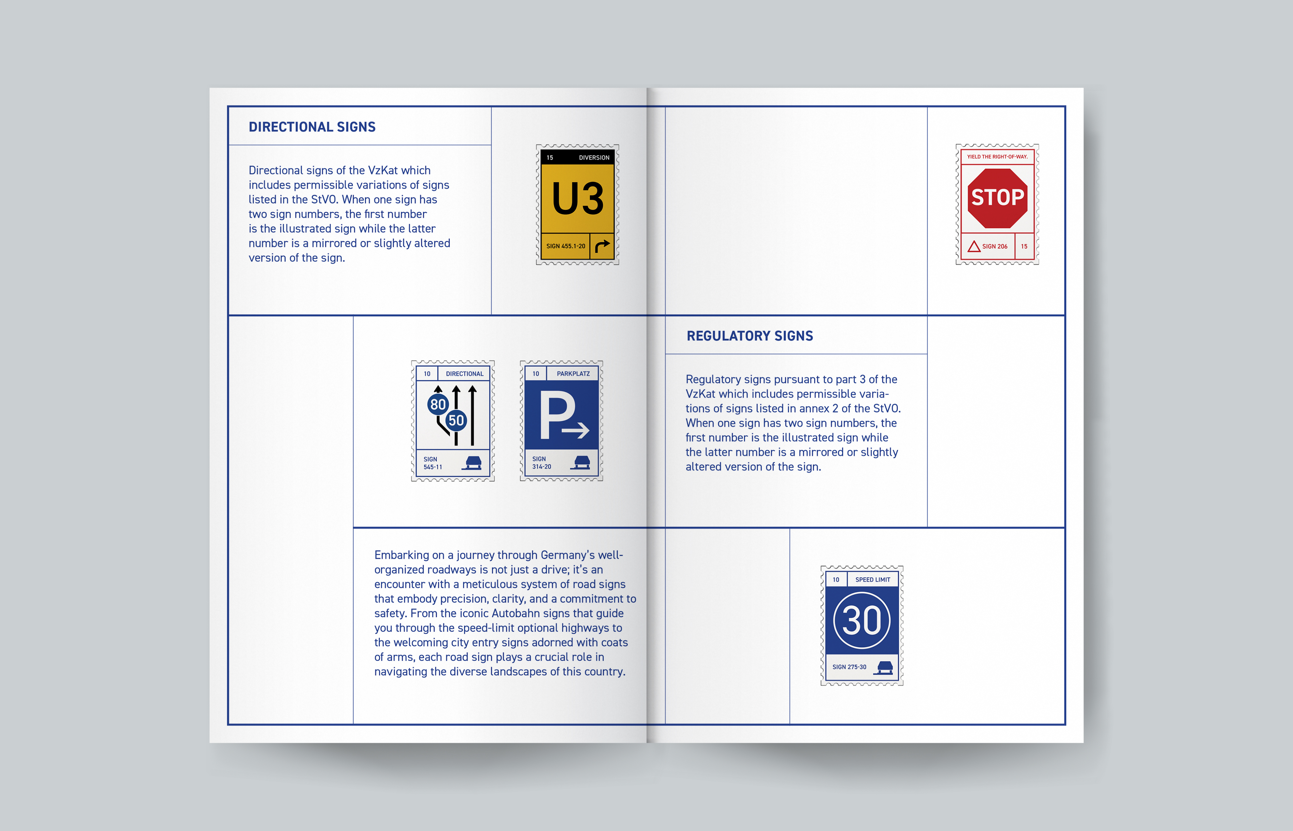
Din is a classic and widely used sans-serif font that originated in Germany. The DIN standards emphasize clarity, consistency, and simplicity in design, aiming to create a universal language that transcends cultural and linguistic barriers. This commitment to precision and legibility makes DIN an invaluable reference for the development of signage systems. In this type of specimen book, I not only showcased the anatomy and various weights of the DIN typeface but also demonstrated its versatility across different design applications in public transportation signages. Inspired by the German subway (U-Bahn) signages I recreated, I wanted to build a set of signages for the Shanghai metro system using Din as my only typeface, to replace the original design with both Chinese and English texts. While creating something new, I strictly adhered to the original design elements and layout system. The project harmoniously blends German design inspiration, DIN typography, and the functional needs of the Shanghai metro system.
